2020 Pantone Color Cues
“Colors, like features, follow the changes of the emotions” – Pablo Picasso
From fashion, fine furnishings, and all forms of design, creatives often choose their hues based on seasonal cues from The Pantone Color Institute™. Through their pristine global trend predictions, these clever chroma curators help guide designers via the power, psychology, and emotion of color. In landscape design, color can help create an emotional connection to your outdoor environment. Careful color choices can either induce quiet serenity or ignite electric energy. Whatever your desired effect, our designers at Bonick can brighten your gardens with beautiful blooms and enliven your living space with decorative design details that reflect your personal aesthetic. So, without further adieu, let’s explore how to make various tints and shades of the Pantone 2020 Spring/Summer palette work for you.
Calming Blue Hues
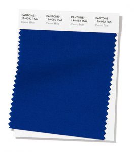
- Classic Blue
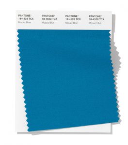
- Mosaic Blue
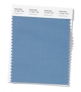
- Faded Denim
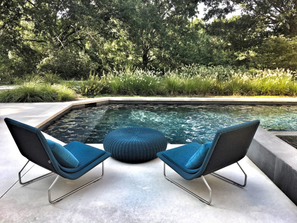
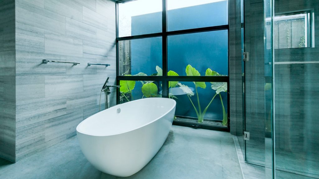
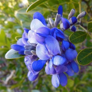
Blues reign supreme in this year’s color palette. While Picasso’s “Blue Period” made the color world-renown for sadness, this conservative cast has also been proven to increase productivity, and instill a sense of stability and serenity. From garden beds to outdoor accent rugs, there are numerous ways to make these cool hues work for you—and your outdoor living space.
Pantone’s 2020 Color of the Year
This year’s number one honest, relaxed hue is PANTONE 19-4052 Classic Blue. The star of the 2020 color show is “evocative of the vast and infinite evening sky opening us up to a world of possibilities.”
Like your favorite comfortable jeans, Faded Denim can add ease to your outdoors. Pair it with Classic Blue or garnish your garden with the graceful Mosaic Blue to add mystique and depth.
Brighten Your Beds with Blue Plants and Flowers
Spring Annuals – Blue Daze, Lobelia
Summer Annuals – Victoria Blue Salvia, Plumbago
Perennial – Veronica Blue, Delphinium, Balloon Flower, Aster
Bulb – Hyacinth
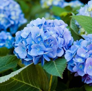
Shrub – Endless Summer Blue Hydrangea
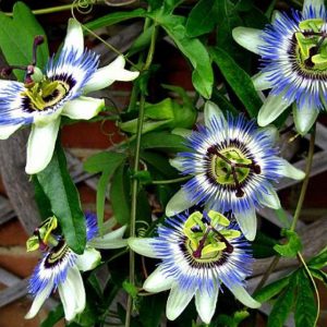
Vine – Passion Vine
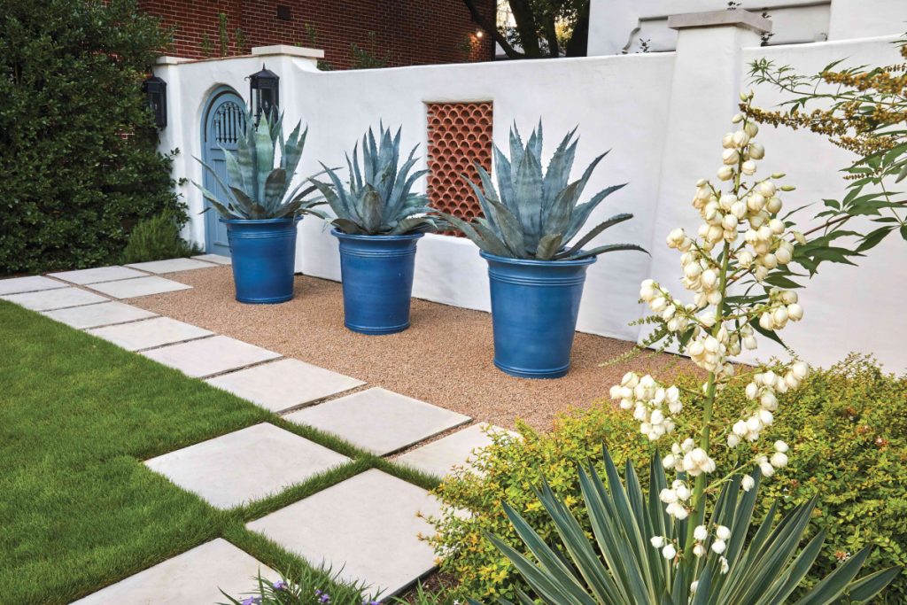
Blue agave, Blue Fescue, Yucca
Sunny & Bright
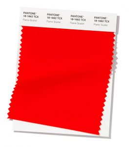
- Flame Scarlett
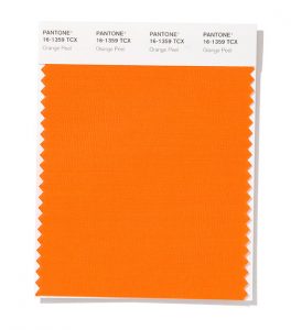
- Orange Peel
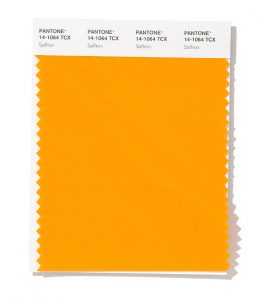
- Saffron
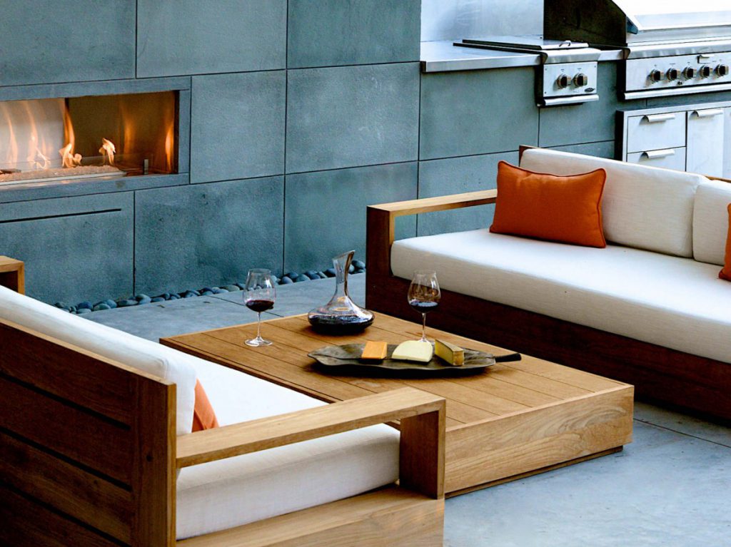
These bold stains instill warmth and confidence. Cheerful Saffron commands attention and brings a balmy bliss to your space. Refreshing and enthusiastic, incorporate the tasteful Orange Peel to add extra energy. Flashy Flame Scarlett burns fiercely bright with passion, love, and determination to add a little pizazz to your patio.
Heat up your haven with seasonal warmth:
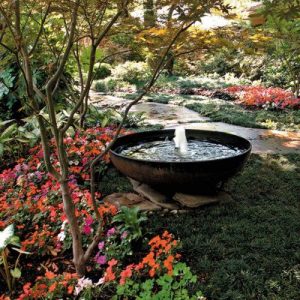
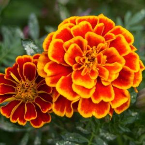
Annuals: Poppy, Zinnia, Marigolds, Zinnia, Tulips, Ranunculus
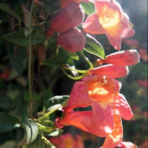
Vine: Trumpet Vine
Shrub: Lantana
Soft Accents
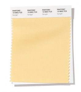
- Sunlight
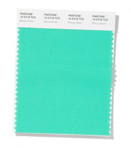
- Biscay Green
Pull from Pantone’s paler palette or combine these softer shades with brights for a dramatic effect. Here are a couple of great examples on how to execute this color combination.
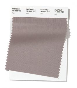
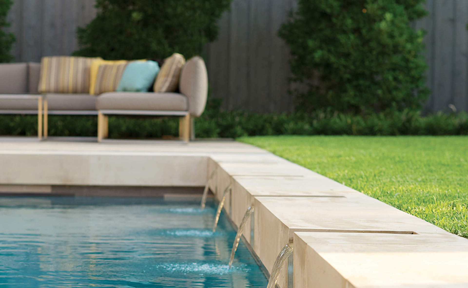
Soothing Sunlight brightens up this stable, grounded Ash sectional for perfect poolside lounging.
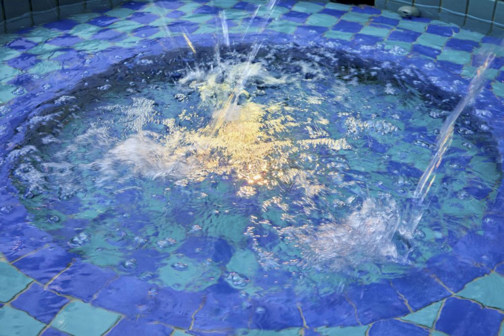
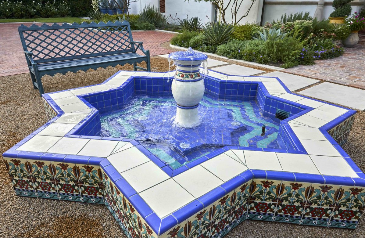
Classic Blue intermingles with Biscay Green to create a spectacular splash.
Whatever colors you’re craving, our expert landscape designers and garden managers can tailor your space with thoughtful, personal planning to incorporate your favorite Pantone colors. Contact us today for a consultation.
